Introduction
A map can be simply defined as a graphic representation of the real world. This representation is always an abstraction of reality. Because of the infinite nature of our Universe it is impossible to capture all of the complexity found in the real world. For example, topographic maps abstract the three-dimensional real world at a reduced scale on a two-dimensional plane of paper.
Maps are used to display both cultural and physical features of the environment. Standard topographic maps show a variety of information including roads, land-use classification, elevation, rivers and other water bodies, political boundaries, and the identification of houses and other types of buildings. Some maps are created with very specific goals in mind. Figure 2a-1 displays a weather map showing the location of low and high pressure centers and fronts over most of North America. The intended purpose of this map is considerably more specialized than a topographic map.
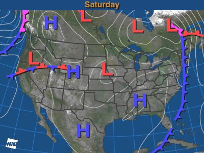
Figure 2a-1: The following specialized weather map displays the surface location of pressure centers and fronts for Saturday, November 27, 1999 over a portion of North America. |
The art of map construction is called cartography. People who work in this field of knowledge are called cartographers. The construction and use of maps has a long history. Some academics believe that the earliest maps date back to the fifth or sixth century BC. Even in these early maps, the main goal of this tool was to communicate information. Early maps were quite subjective in their presentation of spatial information. Maps became more objective with the dawn of Western science. The application of scientific method into cartography made maps more ordered and accurate. Today, the art of map making is quite a sophisticated science employing methods from cartography, engineering, computer science, mathematics, and psychology.
Cartographers classify maps into two broad categories: reference maps and thematic maps. Reference maps normally show natural and human-made objects from the geographical environment with an emphasis on location. Examples of general reference maps include maps found in atlases and topographic maps. Thematic maps are used to display the geographical distribution of one phenomenon or the spatial associations that occur between a number of phenomena.
Map Projection
The shape of the Earth's surface can be described as an ellipsoid. An ellipsoid is a three-dimensional shape that departs slightly from a purely spherical form. The Earth takes this form because rotation causes the region near the equator to bulge outward to space. The angular motion caused by the Earth spinning on its axis also forces the polar regions on the globe to be somewhat flattened.
Representing the true shape of the Earth's surface on a map creates some problems, especially when this depiction is illustrated on a two-dimensional surface. To overcome these problems, cartographers have developed a number of standardized transformation processes for the creation of two-dimensional maps. All of these transformation processes create some type of distortion artifact. The nature of this distortion is related to how the transformation process modifies specific geographic properties of the map. Some of the geographic properties affected by projection distortion include: distance; area; straight line direction between points on the Earth; and the bearing of cardinal points from locations on our planet.
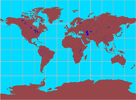
The illustrations below show some of the common map projections used today. The first two-dimensional projection shows the Earth's surface as viewed from space (Figure 2a-2). This orthographic projection distorts distance, shape, and the size of areas. Another serious limitation of this projection is that only a portion of the Earth's surface can be viewed at any one time.
The second illustration displays a Mercator projection of the Earth (Figure 2a-3). On a Mercator projection, the north-south scale increases from the equator at the same rate as the corresponding east-west scale. As a result of this feature, angles drawn on this type of map are correct. Distortion on a Mercator map increases at an increasing rate as one moves toward higher latitudes. Mercator maps are used in navigation because a line drawn between two points of the Earth has true direction. However, this line may not represent the shortest distance between these points.
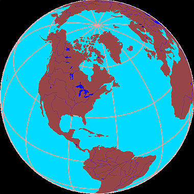
| Figure 2a-2: Earth as observed from a vantage point in space. This orthographic projection of the Earth's surface creates a two-dimensional representation of a three-dimensional surface. The orthographic projection distorts distance, shape, and the size of areas. |
| Figure 2a-3: Mercator map projection. The Mercator projection is one of the most common systems in use today. It was specifically designed for nautical navigation. |
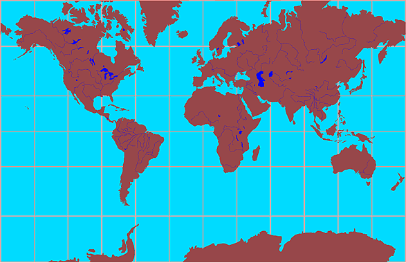
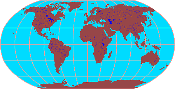
The Gall-Peters projection was developed to correct some of the distortion found in the Mercator system (Figure 2a-4). The Mercator projection causes area to be gradually distorted from the equator to the poles. This distortion makes middle and high latitude countries to be bigger than they are in reality. The Gall-Peters projection corrects this distortion making the area occupied by the world's nations more comparable.
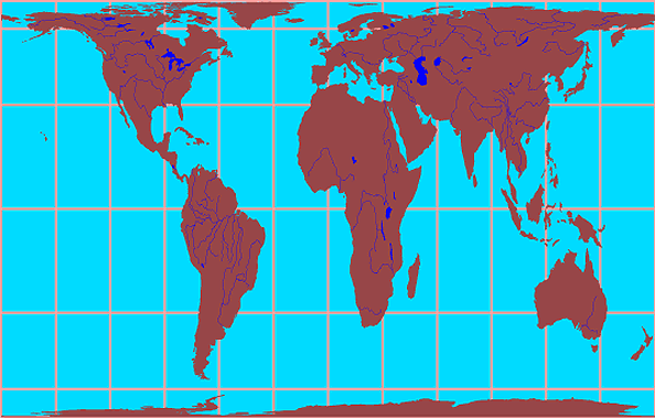
Figure 2a-4: Gall-Peters projection. The Gall-Peters projection corrects the distortion of area common in Mercator maps. As a result, it removes the bias in Mercator maps that draws low latitude countries as being smaller than nations in middle and high latitudes. This projection has been officially adopted by a number of United Nations organizations. |
The Miller Cylindrical projection is another common two-dimensional map used to represent the entire Earth in a rectangular area (Figure 2a-5). In this project, the Earth is mathematically projected onto a cylinder tangent at the equator. This projection in then unrolled to produce a flat two-dimensional representation of the Earth's surface. This projection reduces some of the scale exaggeration present in the Mercator map. However, the Miller Cylindrical projection describes shapes and areas with considerable distortion and directions are true only along the equator.
| Figure 2a-5: The Miller Cylindrical projection. |
Figure 2a-6 displays the Robinson projection. This projection was developed to show the entire Earth with less distortion of area. However, this feature requires a tradeoff in terms of inaccurate map direction and distance.
| Figure 2a-6: Robinson's projection. This projection is common in maps that require somewhat accurate representation of area. This map projection was originally developed for Rand McNally and Company in 1961. |
The Mollweide projection improves on the Robinson projection and has less area distortion (Figure 2a-7). The final projection presented presents areas on a map that are proportional to the same areas on the actual surface of the Earth (Figure 2a-8). However, this Sinusoidal Equal-Area projection suffers from distance, shape, and direction distortions.
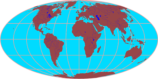
| Figure 2a-7: Mollweide projection. On this projection the only parallels (line of latitude) drawn of true length are 40° 40' North and South. From the equator to 40° 40' North and South the east-west scale is illustrated too small. From the poles to 40° 40' North and South the east-west scale is illustrated too large. |
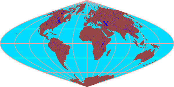
| Figure 2a-8: Sinusoidal Equal-Area projection. |
Map Scale
Maps are rarely drawn at the same scale as the real world. Most maps are made at a scale that is much smaller than the area of the actual surface being depicted. The amount of reduction that has taken place is normally identified somewhere on the map. This measurement is commonly referred to as the map scale. Conceptually, we can think of map scale as the ratio between the distance between any two points on the map compared to the actual ground distance represented. This concept can also be expressed mathematically as:
![]()
On most maps, the map scale is represented by a simple fraction or ratio. This type of description of a map's scale is called a representative fraction. For example, a map where one unit (centimeter, meter, inch, kilometer, etc.) on the illustration represents 1,000,000 of these same units on the actual surface of the Earth would have a representative fraction of 1/1,000,000 (fraction) or 1:1,000,000 (ratio). Of these mathematical representations of scale, the ratio form is most commonly found on maps.
Scale can also be described on a map by a verbal statement. For example, 1:1,000,000 could be verbally described as "1 centimeter on the map equals 10 kilometers on the Earth's surface" or "1 inch represents approximately 16 miles".
Most maps also use graphic scale to describe the distance relationships between the map and the real world. In a graphic scale, an illustration is used to depict distances on the map in common units of measurement (Figure 2a-9). Graphic scales are quite useful because they can be used to measure distances on a map quickly.
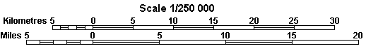
Figure 2a-9: The following graphic scale was drawn for map with a scale of 1:250,000. In the illustration distances in miles and kilometers are graphically shown. |
Maps are often described, in a relative sense, as being either small scale or large scale. Figure 2a-10 helps to explain this concept. In Figure 2a-10, we have maps representing an area of the world at scales of 1:100,000, 1:50,000, and 1:25,000. Of this group, the map drawn at 1:100,000 has the smallest scale relative to the other two maps. The map with the largest scale is map C which is drawn at a scale of 1:25,000.
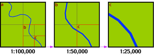
| Figure 2a-10: The following three illustrations describe the relationship between map scale and the size of the ground area shown at three different map scales. The map on the far left has the smallest scale, while the map on the far right has the largest scale. Note what happens to the amount of area represented on the maps when the scale is changed. A doubling of the scale (1:100,000 to 1:50,000 and 1:50,000 to 1:25,000) causes the area shown on the map to be reduced to 25% or one-quarter. |